Let's start with a hard truth: when we draw data, chasing complexity is a trap.
We often assume that a good chart needs more—more data, more dimensions, more polish. A chart isn't good because it's brilliantly dense, or because it's cleanly spare. It's good when every single mark on it earns its place. Fitness to purpose is everything. Complexity was never the point.
To illustrate this very debatable topic, I will present two charts in this article that sit at the opposite ends of the spectrum for complexity. Both have stood the test of time long before I even started working in this field. And I could not think of a better way to kick off this series than going over two of my favorite charts of all time.
The first one is so simple that anyone can draw it and explain it in a matter of minutes. The other is so intricate it took a civil engineer with decades of experience to put together. If complexity was the point, the first chart would never have survived the test of time. Yet, they both did. Today, they sit side by side at the very top of the craft, both flawless on their own terms. Below, I'm showing the two of them together.
Two Cubes Illustrating Cognitive Surplus
~100 million hours · cumulative, all-time
~200 billion hours · per year (US, 2008)
Sized honestly: the big cube's volume is 2,000× the small one, so its edge is only about 12.6× longer. Two numbers, drawn to scale — no axes, no legend, nothing to remove.
Let's first cover the simple one. This is essentially two cubes. Over the years this has been drawn in a few different ways but they always show how a simple visual can communicate the point effortlessly.
Around 2008, writer Clay Shirky and Martin Wattenberg from IBM teamed up and measured the human hours needed to build Wikipedia. They measured this number at a staggering 100 million hours. This number seems big, right? Hold on to that thought. The authors then measured that number against Americans watching television every single year. This second number came to be 200 billion hours (Yes, Billion with B).
Billion is a hard number to intuitively think of. To illustrate 200 billion against 100 million, imagine all Americans stopped watching TV and spent that time building Wikipedias instead — they'd finish about 40 every week (Yes, every week). And when I say Wikipedia I mean every article, every edit, every talk-page argument, every line of code, in every language. And remember, I just said Americans, one country in the entire world.
That comparison is the chart. Draw it as two cubes — a small one for Wikipedia, a vast one for television — and you have a complete visualization holding exactly two numbers. No axes. No legend. No trend. And it does something a table of those same figures can't: it makes you feel the gap. It answers a question you didn't know you were asking — the one a TV producer asked Shirky when she heard how Wikipedia gets made: "Where do people find the time?" The cube is the answer. The time was never missing. This idea is central to Clay Shirky's famous concept "Cognitive Surplus."
The figure has aged in a strange direction, too. Shirky's 200 billion was all TV, in 2008. Today streaming alone is about 278 billion hours a year, by Nielsen Media Research's 2025 count. And that only counts streaming through a television set; the phone in your hand doesn't even get factored in the mass of the cube. The cube hasn't shrunk with time. It's grown.
Below is a stripped-down, interactive version of it — not a replacement, just a way to take one idea apart. Flip it from honest volume scaling to naïve length scaling and watch the big cube burst off the frame. That's what a careless chart does without meaning to.
~100M hrs
~200B hrs/yr
Volume scaling. Edge ∝ ∛hours, so the edge ratio is only ~13×. Honest — but your eye reads volumepoorly and still under-feels the true gap.
The asymmetry is on purpose: Wikipedia is a one-time cumulative total; TV / streaming is per year.
Six variables depicting the French invasion of Russia
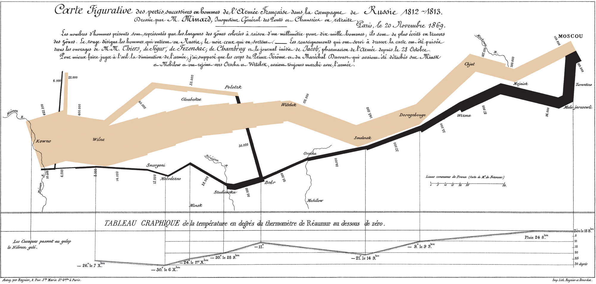
In 1869, Charles Joseph Minard drew the retreat which depicts Napoleon's 1812 invasion of Russia, and his chart — a flow map barely two hand-spans wide — follows the Grande Armée from the moment it crossed the Niemen, 422,000 strong, to the moment the survivors staggered back out: about 10,000 men (more than 95% of its soldiers died). The band standing in for the army is fat at the start and thread-thin at the end. The thinning is the story. You watch an army die by attrition across the width of a page.
Minard folded six variables into that flat drawing: the size of the army (the band's thickness), where it was (latitude and longitude), which way it was headed (color — pale tan advancing, black returning), the temperature (a line graph along the bottom), and the dates behind those temperatures. The retreat band and the temperature line are tied together, so you can do what no single number allows: watch the cold and the dying move in step. The band collapses hardest where the temperature plunges. At the Berezina crossing — some 50,000 men approached, about 28,000 made it across — it halves before your eyes.
Where the cubes land in a glance, Minard rewards a long stare; you keep finding things. Edward Tufte built The Visual Display of Quantitative Information (1983) partly around it, calling it a chart that may well be the best statistical graphic ever drawn
. (Hold onto that — there's an irony in it we'll come back to.)
Charles Joseph Minard, 1869. Carte figurative des pertes successives en hommes de l'Armée Française dans la campagne de Russie 1812–1813.
View in full resolution on Wikimedia Commons →
That's the artifact — every stroke load-bearing. Below it sits a simplified, interactive companion: a clean redraw that keeps the route and the tan-and-black, built only so you can run your cursor along the retreat and feel the two lines move together.
Hover the army band or the temperature line — six variables in two dimensions. Hovering the cold highlights where the army died.
Information is not insight
Two contenders. One carries almost no data and is unforgettable. The other carries a great deal and is also unforgettable. Both of these visual artists could have easily gone the other route. Shirky could have drawn a tidy, detailed bar chart and poured in all the details about Wikipedia and Americans' TV-watching patterns. Minard could have just drawn a single dwindling line to show a headcount. Each saw the alternative and deliberately chose not to take it. They knew exactly what their data demanded, which is part of why they belong at the top. So, what follows is simply a look at why the road each picked was the right one.
It helps to pull apart two words we tend to blur:
- Information is how much data sits on the page.
- Insight is what you walk away understanding.
We assume the second rides on the first — that more data buys more understanding. It doesn't. The cube is nearly empty of information and full of insight. Minard is full of both. A cluttered dashboard can drown in data and leave you with nothing; a single number, placed right, can change how you see the world.
So, plainly: insight does not track data density. That's the spine of this whole series. Clarity is harder than complexity, because complexity is what you reach for before you've found the one view that makes the point.
Why each one works
The two charts win by opposite means. It's worth seeing how.
The cube wins by distorting — on purpose. Scale the side of each cube to the hours and the volume you see grows as the cube of the ratio: a 2,000-to-1 gap balloons into nonsense. Scale by volume instead and your eye underreads it, because people judge volume badly. Either way, you can't read a true ratio off two cubes — and that's fine. Cleveland and McGill settled this in 1984: volume sits near the bottom of the accuracy ranking, position on a common scale at the top. The cube reaches for the least precise encoding there is, because precision was never its job. Its job is to make you feel a gulf in one glance. The "wrong" tool is the right one.
Minard wins by integrating. The usual rule is show one thing clearly. Minard fuses six — and the fusion is the whole point. Break those variables into six tidy charts and the army's death floats free of the cold; the thing you most need to see evaporates into a stack of correct, lifeless panels. Held together, it turns visceral. You don't read that the cold killed them. You watch it happen.
Which is the irony worth holding onto. Tufte — the great preacher of less ink, more data — picked as his finest example the densest famous chart in history. The contradiction dissolves the moment you stop counting complexity and start counting waste. His rule was never less. It was nothing wasted. By that measure the cube and the campaign are the same chart in different clothes: each spends exactly what it needs, and not a stroke more.
The north star
So that's the standard this series holds itself to. Not make it simple. Not make it rich. Make every element earn its place, and let the purpose decide how much that takes. Sometimes the honest answer is two numbers in a box. Sometimes you need six dimensions at once. The craft isn't picking simple or complex — it's knowing which one the data in front of you is asking for, and having the nerve to draw only that.
Once you understand this craft, you can't unsee it. You'll catch it everywhere — in the news, in the slide deck, in the dashboard down the hall. And the next chart you draw will be a little harder to get wrong.
Further reading
The Underappreciated Man Behind the "Best Graphic Ever Produced" — Betsy Mason, National Geographic (2017). If the campaign map made you curious about the man who drew it, this is the place to go next. Minard was no one-hit wonder: the piece walks through his flow map of global emigration in 1858, his maps of cotton imports to Europe before and after the American Civil War, and his proportional pie-chart maps — all of them bending geography to serve the data, exactly as the Russia map does. It also surfaces a detail most admirers never learn: Minard originally paired Napoleon's March with a matching chart of Hannibal's 218 BC crossing of the Alps. He was, in other words, a man who understood the power of putting two campaigns side by side — which is the same move this chapter just borrowed from him.
Mastering Data Visualisation: Understanding the Hierarchy of Visual Cues — Donmez, LinkedIn (2023). The cube's "volume distorts" claim isn't just an aesthetic opinion — it sits at the bottom of a measured hierarchy of how accurately people read different visual encodings. This piece reproduces that hierarchy (Alberto Cairo's "Perceptual Ranking Diagram," built on Cleveland and McGill's foundational 1984 study): position along a common scale at the top, with area, volume, and color hue near the bottom. It's worth seeing where every encoding the cube could have used would have landed — and why the one it actually chose is the least precise of them all. Which, for this chart, is the whole point.